DOI: 10.1002/col.21853 | CITEULIKE: 12937794 | REFERENCE: BibTex, Endnote, RefMan | PDF ![]()
Bartneck, C., & Clark, A. (2015). Semi-Automatic Color Analysis For Brand Logos. Color Research and Application, 40(1), 72-84.
Semi-Automatic Color Analysis For Brand Logos
HIT Lab NZ, University of Canterbury
PO Box 4800, 8410 Christchurch
New Zealand
christoph@bartneck.de
Abstract - Brand logos are essential for companies and their design is at the heart of graphic design. In a global market, the number of competing logos has grown exponentially. We present a software tool that helps designers to semi-automatically analyze large sets of graphics. The results of the color analysis help designers to make informed choices for their designs. We present two case studies that demonstrate the operation of our software tools. The first case study analyzed the logos of countries: flags. The second case study analyzed the logos of financial institutions. In addition to the descriptive statistics, we also put the results of the color analysis into relation with social-economic indicators. Our software tools have been successful at offering logo designers valuable information for the design of new logos.
Keywords: color, analysis, logos, flags
Download Flags and Software
The complete software, flags and color data is available in this zip file. You may use it under the Creative Commons Attribution-NonCommercial license.
1 Introduction
Developing a brand and, more specifically, developing a logo, is an important aspect for almost all companies. There are many books available that describe best practices on how to develop logos [11] and even more formal processes have been developed [4]. The choice of colors for a logo is essential for the design and some companies have even protected a certain color as their brand, for example, Deutsche Telekom protected the color RAL-4010, “Deutsche Telekom Magenta”, as being part of their brand and did not shy away from suing Mobilcom AG in 2003 for the abuse of this color. It has also been shown that the choice of colors in logo can have a significant effect on how the logo is perceived in terms of functional and sensory-social effects[3]. Color has become an integral part of brand design and it is necessary to consider the colors of your competitors when designing a new logo.
In a global market, the choice of colors has to work across cultures and several studies have investigated the perception of brand colors and their meanings across cultures [7, 5]. One problem that a global market brings is that the number of competitors increases dramatically. A purely manual process soon becomes impractical and a semi automatic approach is advisable. Wang Qingbin made a first attempt at analyzing the occurrence of colors in brand logos [13]. He did not, however, consider the size of the surface that each color occupies. The results obtained are therefore only useful to a limited degree.
We want to explore a quantitative approach for choosing the colors for a logo. There is much more to logo design, such as the core idea, shapes and typography. We cannot offer a method for all of these aspects and it can even be argued that the creative process cannot be replaced with a calculation. However, software systems can help the creative designer to make good decisions. Arthur Buxton developed software that automatically analyzed the distribution of colors in Penguin Science Fiction Covers1 and the Covers of the Vogue magazine2 . He concluded that the recent emphasis on paler colors is a major trend and that subtle seasonal changes in colors are becoming more prevalent.
There are two phases in which a software system can be helpful. Firstly, it can quickly analyze large numbers of logos or other graphics and summarize the usage of the colors therein. Secondly, it can make suggestions on what colors to use. For example, a possible query towards a software system could be: Pick the least frequent combination of x colors from the most popular colors y from a sample z.
In the urban design research area color mapping has been used to summarize the visual impression of the environment [12, 9]. Zena OConnor even applied a color mapping approach to brand logos [10], but she used the Photoshop application to manually extract colors. While such a manual process can be useful to analyze a small number of images, it becomes too labor-intensive when having to analyze hundreds if not thousands of images.
In this paper we will describe a semi-automatic software system we developed that is able to respond to such queries, and evaluate the software with two case studies. In the first case study we analyzed national flags, which can be considered to be the logo of a country. As they rely on colorful geometrical shapes rather than typography, they present an ideal test bed for our first system design. In our second case study we investigated the logos of popular brands.
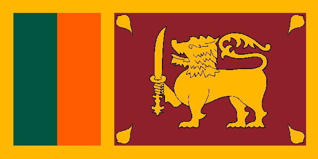
(a) Flag of Sri Lanka
 |
 |
 |
 |
| (b) Color Chart for 1(a) | (c) Nearest Colors in RGB | (d) Nearest Colors in HSV | (e) Nearest Colors in CIELAB |
Figure 1: Nearest neighbor colors in the W3C CSS Color Model definition calculated in different color spaces.
2 System design
Our initial goal was to develop a fully automatic system capable of processing large image data sets to mine information for later analysis. However, when testing against our trial data set of national flags, it became apparent that there are many factors unique to the human visual system, such as the different appearance of a color depending on its neighboring colors, which made completely automatic analysis very difficult. Even comparisons across different color spaces yields different results, as shown in Figure 1 , where colors defined as “Gold”,“Crimson”, “Saffron” and “Green” in Wikipedia3 mapped into the W3C CSS Color Model4 as “Orange”, “Brown”, “OrangeRed” and “DarkSlateGrey” respectively when calculating nearest neighbors in the RGB and CIELAB color spaces, and ‘Orange”, “MediumVioletRed”, “OrangeRed” and “DarkGreen” respectively in the HSV color space.
After initial attempts to design a fully automatic system were unsuccessful, it was decided that a semi-automatic system would be required. In addition to the automatic parts of the system, several tools were developed to aid the user when performing the manual tasks. The following subsections describe each stage in the workflow and the tools which were developed to aid the user.
2.1 Preprocessing source files
In our initial attempt at a fully automatic system, rasterized images were used as the data source. To ensure optimal performance, these images needed to be as high quality and lossless as possible. Despite this, flags with even simple designs often had many variations of visually similar colors, as is shown in Figure 2 .
 |
 |
| (a) Rasterized Flag of Nepal | (b) Color Chart of 2(a) |
Figure 2: The Rasterized Flag of Nepal (Left), and chart of all colors in this image (Right). Note that in this example black pixels are treated as transparent, due to the unique shape of the Nepalese flag.
To reduce the number of colors, an automatic thresholding algorithm was applied. First the colors were ordered by their pixel count, and then, starting from the colors with the lowest pixel count, each color was merged with its nearest neighbor in RGB space if the distance was below a defined threshold. The color with the higher count effectively “absorbed” the color with the lower count, in that all pixels with the color of the lower count had their color changed to that of the higher count. This algorithm was able to significantly reduce the number of unique colors while not removing important colors when the threshold was manually optimized, however there was no single threshold value which worked well for all images. To resolve this, after automatic thresholding, a manual step was introduced where the user was able to combine similar colors together manually by clicking on them.
After initial tests, it became clear that this approach was not feasible for large rasterized data sets due to the large number of colors typically contained in each image and the considerable time required by the user to resolve this manually. To avoid this, rasterized images were replaced with vectorized images, as their precise definition reduced the number of colors present and also allowed for lossless and non anti-aliased resizing of the images. As vector images cannot be processed directly, a preprocessing stage was developed to extract the highest quality rasterized image from the vector image.
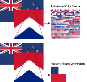
Figure 3: Effect of anti aliasing on the color palette.
The RSVG library5 was used for conversion from the vector image to a raster image. A script was written to iterate through a directory of vector images and convert them to high resolution raster images. Initially, these raster images still contained a large number of colors, even when there were only a few distinguishable colors. On closer inspection, this was found to be an effect of anti-aliasing during the rasterization process, as shown in Figure 3 . The processing script was modified to append a parameter to the SVG style definition tag, which disabled anti-aliasing during the conversion. In addition to the rasterized images, an image file displaying the color palette for each vector image was created to facilitate easy color identification.
 |
 |
| (a) Flag of Guatemala | (b) Color Chart of 4(a) |
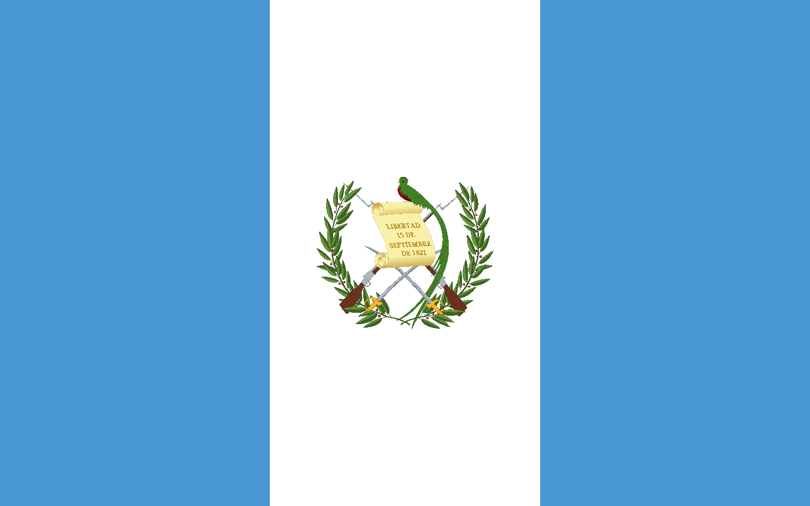
Figure 4: The Flag of Guatemala (Left), and chart of all colors in this image (Right). The high number of colors is mainly due to the color gradient in the scroll.
2.2 Visualization of Data
Examination of the color palette created for each image in the flag data set showed that even visually simple images can contain a significant amount of colors. Color gradients, which are common in logos and even some flags, can significantly increase the number of unique colors, as shown in Figure 4 . These gradients also present a significant challenge for automatic segmentation of colors, as the exact point where a gradient changes from one color to the other depends on a number of factors such as the hue and saturation of colors, as well as surrounding colors and their context within the rest of the image.
Another problem which arose was the lack of consistency in the definition of any given color, particularly in images which come from different sources. In the Flag dataset, even “primary colors” were represented by a range of unique colors. To create a means of classification, we began with a simple overview of the complete dataset. The color of every pixel in every image in the dataset was counted, and the results were plotted in descending order in the Hue, Saturation and Value (HSV) color space. From this HSV image, common colors in a dataset could be identified. In the case of the flag dataset, there were seven common colors: black, white, red, yellow, green, light blue and dark blue, as shown in Figure 5 .
Figure 5: Distribution of colors in the flag dataset, sorted by hue. As hue is a circular metric, the red shades at the end wrap around to the red shades after white. There are seven visible bands: black, white, red, yellow, green, light blue and dark blue.
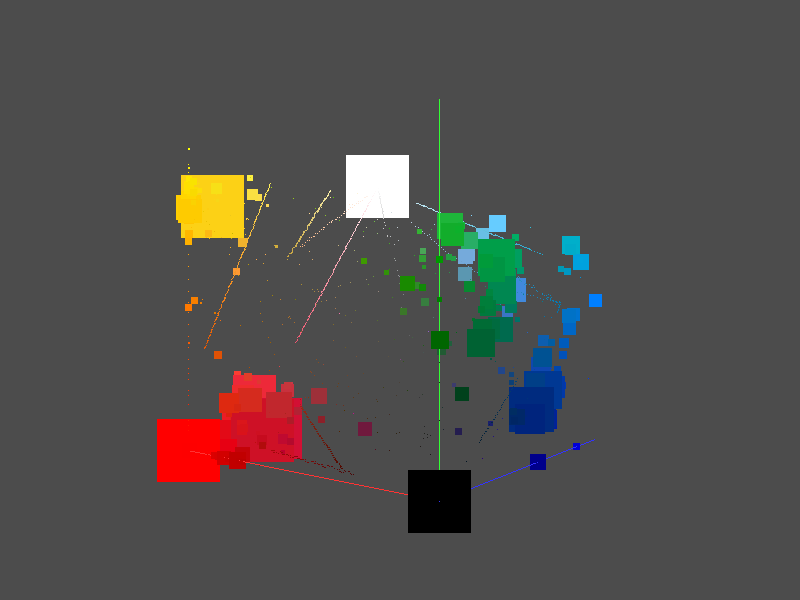
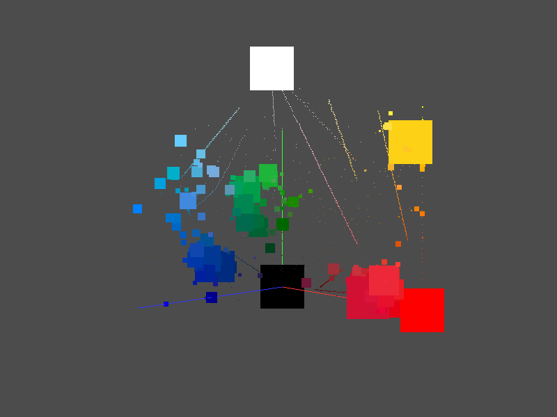
Once the common colors in the dataset were determined, the next step was to determine which non-common colors map to which common colors. To do this, a three dimensional visualization of the RGB color cube was constructed and populated with the pixels from all the images in the dataset, as shown in Figure 6 . Each axis represents the value of red, green blue for each pixel. The color cube could be navigated by rotation around the Z axis and zoomed in and out using the keyboard. The size of each point was determined by the number of pixels which have that color, and this scale was determined by the size of the window rather than the distance between the view point and the data point, to ensure points did not appear less significant even if further away.
 |
 |
| (a) View 1 | (b) View 2 |
Figure 6: Distribution of colors in the flag dataset in the RGB Cube.
It is worth noting that in the flag dataset shown in Figure 6(b) , there are several visible straight lines. These lines are due to gradients in some of the datasets, and typically range from a saturated color to white, although in some cases the gradients run from one color to a different color (such as red to yellow).
2.3 Rough Categorization
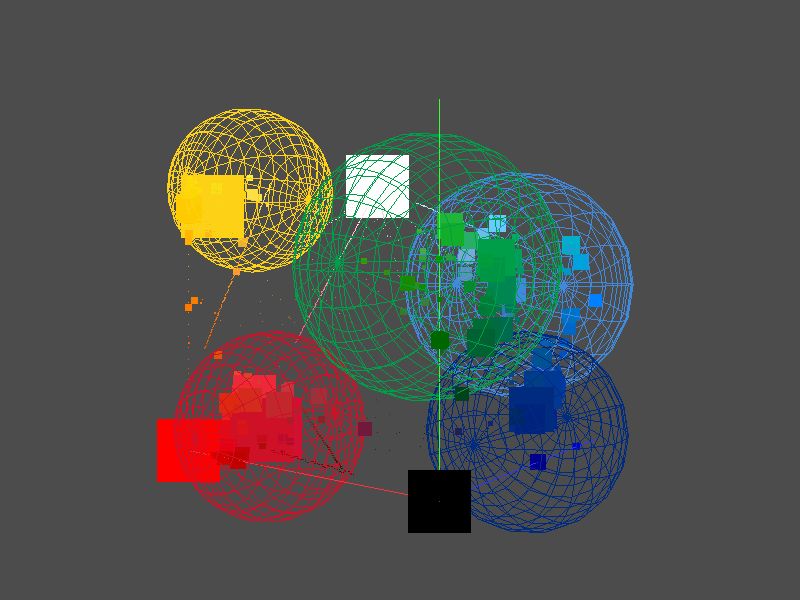
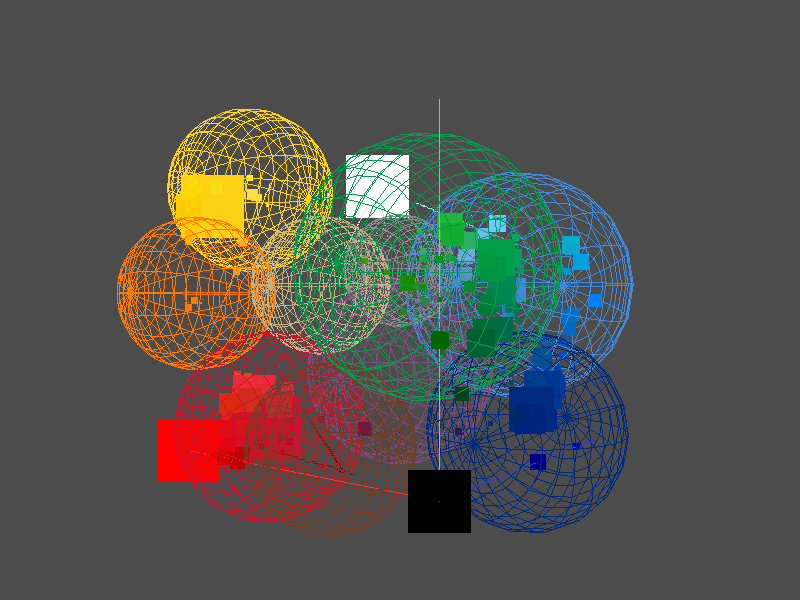
To allow categorization of the colors into the color model, the 3D Visualization tool developed in Section 2.2 was extended. A user would create a new category by clicking on the desired color, and then click on other colors which should map to that color. This mapping was represented visually as a sphere which encompassed all the selected colors. For example, if the user wanted to create a new category for Dark Blue (RGB(0,43,127)), they would click on that color, and then click on colors which should map to that category (e.g. RGB(0,0,139), RGB(0,56,147)). Figure 7 shows the spheres used to categorize the seven common colors in the Flag Data set.
 |
 |
| (a) View 1 | (a) View 2 |
Figure 7: The original seven color model mapping for the flag dataset (including black and white).
Points which lay within the intersection of two spheres would be classified as being part of the sphere which was created first. Users could switch between categories to add additional points, and also hide all points in a category to better see uncategorized points. Additionally, users could right click on a color to see all the flags which featured that color, which allowed them to make an informed decision about which category ambiguous colors should fall into.
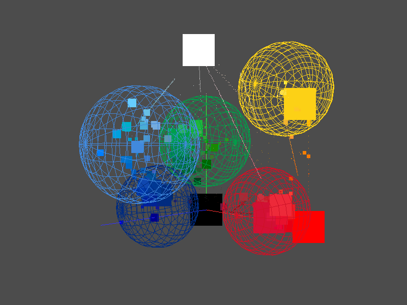
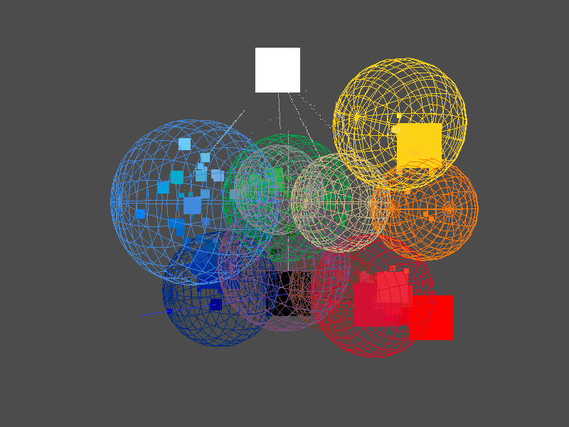
To test how well the color model fits the dataset, a tool was developed which allowed the user to compare each image in the dataset before and after its colors were mapped into the color model. Images containing colors which could not be mapped triggered an alert, and these missing colors were shown to the user. After examining the Flag Dataset it was discovered that there were five additional common colors that were not obvious in the HSV diagram. The new colors were orange, purple, light brown, dark brown and gray. Figure 8 shows the revised color model for the flag dataset.
 |
 |
| (a) View 1 | (a) View 2 |
Figure 8: Revised 12 color model for the flag dataset (including black and white).
2.4 Fine Tuning
Even after the color model has been created and revised for a dataset, it is possible that edge cases, such as gradients, still exist. Additionally, some colors also have specific meaning (e.g. the Sri Lankan Flag described in Section 2 ), or look different in the context of their neighboring colors or the image overall, and may be classified incorrectly.
To allow manual correction, a tool was developed which showed the flag before and after model mapping, as well the palettes of both images. Users could select colors in the “before” palette, and assign them to map to colors in the “after” palette. These rules were stored on a per-image basis. While this is potentially a time-consuming task, in the case of the flag dataset the automatic classification step was able to successfully classify over 80% of the images, with 58% of the remaining images only needing one modification (e.g. light blue to dark blue), and 77% needing fewer than five changes.
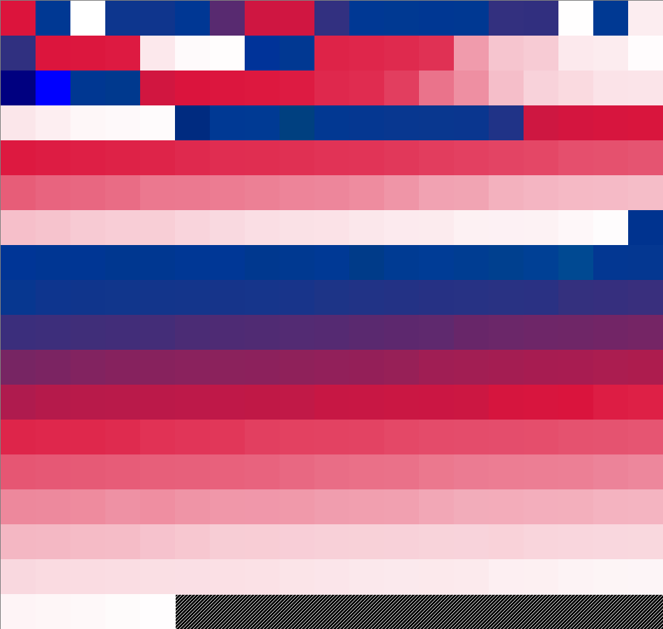
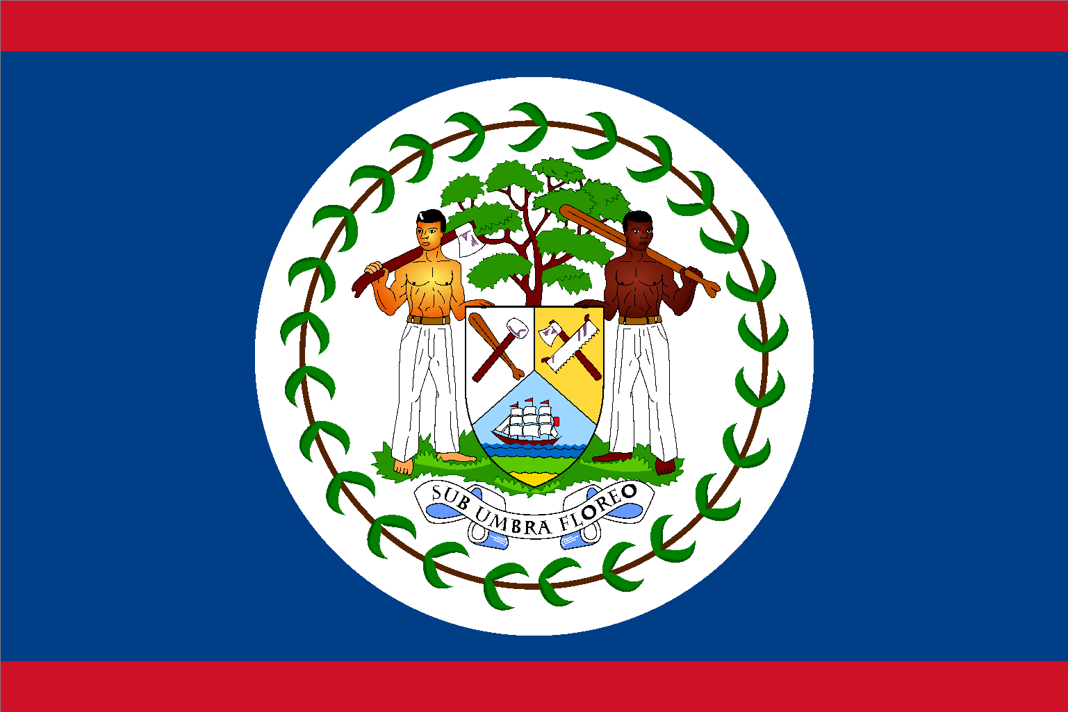
In the Flag dataset, only 3% of unsuccessfully classified images required significant fine tuning, with an average of 177 changes per image. In each case this was due to color gradients, such as the flag of Belize shown in Figure 9 . While there are visual differences between the two flags, the aim was to categorize the 326 colors of the original image into the 12 color model, and we feel the colors chosen best represent the colors in the original flag.
 |
 |
| (a) Before Categorization | (b) After Categorization |
Figure 9: The flag of Belize before and after categorization and fine tuning.
Once all images in the dataset could have all colors classified correctly, we were able to collect statistics and analyze color trends within the data set.
3 Case study: Vexillology
The study of flags, also referred to as Vexillology, is an important field of research, in particular in the context of history. Several encyclopedias are available [14] that list flags of sovereign nations, organizations and military units. They also explain in detail their history, usage and cultural meaning. Flags are also part of popular culture. In the famous TV show “The Big Bang Theory”, Sheldon Cooper, played by Jim Parsons, produces a podcast called “Fun with Flags” that features several famous actors, such as Wil Wheaton and Levar Burton. Flags are also emotional symbols that have a high importance. The flag of the USA frequently gets burned in public in certain countries to express disrespect. We also carry flags when entering the Olympic Games.
Flags do have a rich and long history, but in this study we want to put these cultural aspects aside and focus on the colors by themselves. In 1969, Martin Lindauer described the distribution of colors in flags [6] and concluded that the distribution is not random. The most frequent colors are in descending order red, blue, green and yellow. Jon McLoone went one step further by not only taking the simple occurrence of a color into account, but also calculating its surface size on the flag [8]. We reproduced his color distribution of all national flags and show it in figure 10 . His analysis shows that white is even more frequent than green and that there is a large variety of blues. Adding up all the blues would probably put it back into second place, but it can be argued that the dark blue used in the New Zealand flag is not the same as the light blue used in the Greek flag. The clustering of colors across flags remains a problem that we will attempt to offer a solution to in this paper.
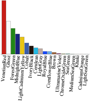
Figure 10: McLoon’s distribution of colors for all national flags
This problem becomes even bigger when not using a simple threshold to decide whether two colors are the same or whether the color should be included in the first place. Many flags have elaborate symbols that use many different colors. The flag of the Vatican City (see Figure 11 ), for example, has the crossed keys of Saint Peter and the Papal Tiara centered in the white band. This symbol features the colors red, green, grey and black.
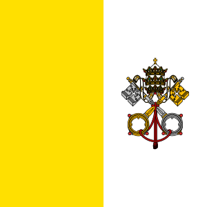
Figure 11: The Flag of Vatican City
There is probably no causal relationship between the colors of a flag and the social economic data of the country it represents. Using a certain color will not make a country richer or poorer and neither do countries choose their colors because of their wealth. Still, the wealth on this world is not evenly distributed and neither are the colors of flags. A superficial look might give the impression that the poor countries in Africa often use the green color. We will investigate this potential correlation. Does red, blue and white symbolize power, size or wealth?
Amavilah made the first attempt to investigate the correlation between flag colors and the well-being of a country [1]. Unfortunately, his arbitrary allocation of numerical values to colors makes any further analysis meaningless. Summing up the values of the colors for a given flag and then using this value to calculate correlations with national indicators is pointless. Jon McLoone also analyzed [8] the colors of national flags and made a similar mistake. Taking the average color of a flag can hardly represent a flag. We all learn in kindergarten that mixing all sorts of colors always ends up in a grey-brown, which is referred to as subtractive color mixing. McLoon took the average of RGB values which is a form of additive color mixing, but the same principle problem remains. Taking the average color of a flag results in a murky grey.
But McLoon did bring up an important point. How unique are flags? Ideally, every country should have a flag that is clearly different from all other flags. This is in particular useful when at war to be able to tell apart friend from foe. In reality, there are several flags that are easy to confuse with another. The flags of Romania and Chad, for example, only differ in their tint of blue (see figure 12 ).
 |
 |
| (a) Flag of Chad | (b) Flag of Romania |
Figure 12: Example of two similar flags
In this study, we will analyze the uniqueness of flags. How frequent are the color combinations? This analysis can also serve to inform designers; not only flag designers, but designers in general. In an economy that overflows with products it becomes increasingly difficult to create a color schema that is popular and unique. The color analysis method offered in this paper can easily be translated to any other artifact.
3.1 Method
We analyzed the colors of 194 sovereign countries as they are listed in Wikipedia. Not all countries listed are undisputed. Pakistan, for example, does not recognize Armenia. It is not clear if ever a complete consensus will be found on sovereign countries, but for now the well-documented Wikipedia list is a good approximation for the purpose of this study.
3.1.1 Data Source
For the reasons explained in Section 2.1 , we used vector graphics (SVG) representations of flags available in Wikimedia as our data source. We cross checked the list against Wolfram Alpha’s (WA) list of countries and observed that France, Morocco and Tunisia were not available in the list of sovereign state flags. 6 We therefore added these three countries to our data source manually.
We also used WA data further on in the paper and hence it is important to note that WA also includes the following countries that are not listed in Wikipedia as sovereign countries: American Samoa, Anguilla, Aruba, Bermuda, British Virgin Islands, Cayman Islands, Christmas Island, Cocos Keeling Islands, Cook Islands, Curacao, Falkland Islands, Faroe Islands, French Guiana, French Polynesia, Gaza Strip, Gibraltar, Guadeloupe, Guam, Guernsey, Hong Kong, Isle of Man, Jersey, Kosovo, Macau, Martinique, Mayotte, Micronesia, Montserrat, New Caledonia, Niue, Norfolk Island, Northern Mariana Islands, Pitcairn Islands, Puerto Rico, Reunion, Saint Helena, Saint Pierre and Miquelon, Sint Maarten, Svalbard, Tokelau, Turks and Caicos Islands, United States Virgin Islands, Wallis and Futuna Islands, West Bank, Western Sahara.
The images were processed as described in Section 2 . The result of this processing stage was a 12-color model which each color in the dataset was mapped to. The name and RGB definition of these colors is shown in Table 1 .
Table 1: The RGB values of the 12 color model for the flag dataset
| Color | R | G | B |
| red | 206 | 17 | 38 |
| white | 255 | 255 | 255 |
| green | 0 | 158 | 73 |
| dark blue | 0 | 43 | 127 |
| yellow | 252 | 209 | 22 |
| light blue | 65 | 137 | 221 |
| black | 0 | 0 | 0 |
| orange | 255 | 121 | 0 |
| purple | 126 | 75 | 126 |
| light brown | 199 | 179 | 127 |
| dark brown | 112 | 61 | 41 |
| gray | 133 | 141 | 141 |
3.2 Results
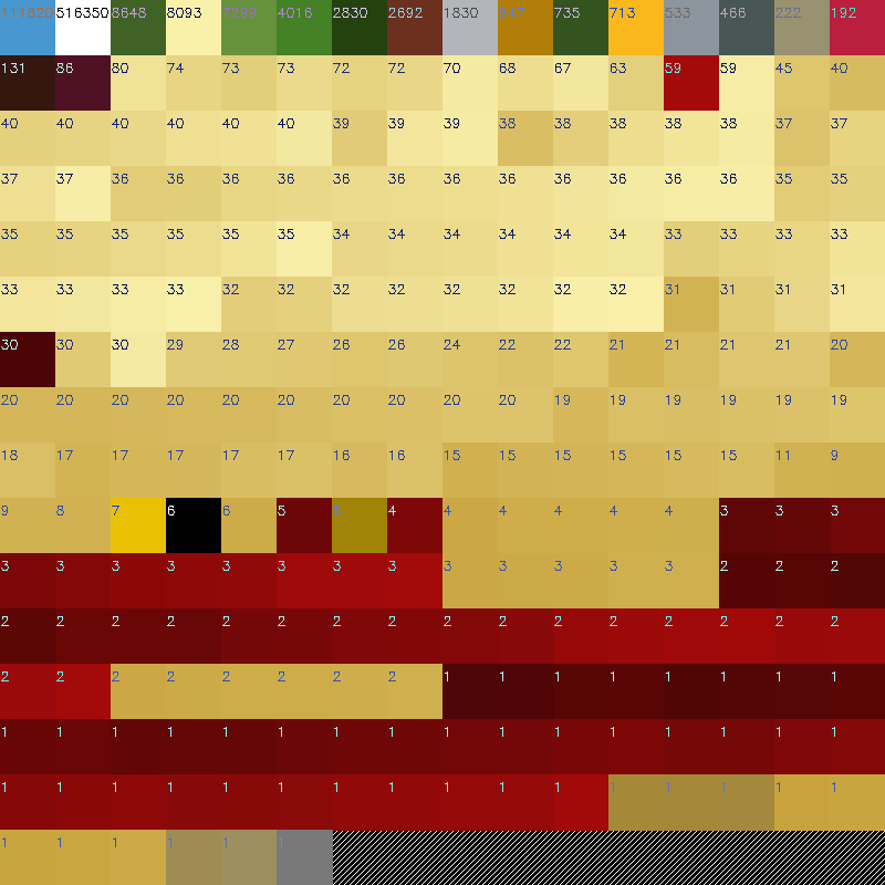
The usage of bitmaps made it easy to calculate the surface coverage of each color. We simply counted the number of pixels for each color. Flags use different proportions and this may influence the absolute pixel count per flag. We therefore transformed the absolute pixel count to a percentage.
We then calculated the distribution of colors across all flags (see figure 13 ). We received a similar result to McLoon, which validates our process. The order of colors for red, white, green, dark blue, yellow, light blue, and black are the same. McLoon’s graph splits out another twelve colors, which we were able to consolidate into five colors. Moreover, McLoon uses five different shades of blue, while our process results in only two.
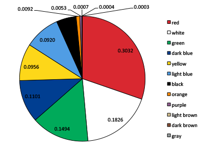
Figure 13: Distribution of normalized colors for all flags.
The occurrence of each color in all the flags is listed in detail in table 2 . The table shows that the colors light brown, dark brown and gray only occur in very small quantities. In fact, they only occur in the symbols of flags, such as in the Spanish flag. Purple only occurs as one of the two colors in the Qatar flag.
Table 2: The 12 colors and their proportional usage in all flags.
| Color | % area | count |
| red | 0.3032 | 155 |
| white | 0.1826 | 144 |
| green | 0.1494 | 97 |
| dark blue | 0.1101 | 68 |
| yellow | 0.0956 | 102 |
| light blue | 0.0920 | 44 |
| black | 0.0512 | 69 |
| orange | 0.0092 | 12 |
| purple | 0.0053 | 6 |
| light brown | 0.0007 | 12 |
| dark brown | 0.0004 | 10 |
| gray | 0.0003 | 7 |
The next step is to use the formula described in the introduction to find the best flag for a new country. Lets consider the simple example of two colored flags. Table 2 already tells us the popularity of each color. We can now put the sum of each combination into a two-dimensional matrix (see table 3 ). It shows that the combination of red and white would be the most popular color combination.
Table 3: Popularity of color combinations.
| red | white | green | d.blue | yellow | l.blue | black | orange | purple | l.brown | d.brown | |
| white | 0.486 | ||||||||||
| green | 0.453 | 0.332 | |||||||||
| dark blue | 0.413 | 0.293 | 0.259 | ||||||||
| yellow | 0.399 | 0.278 | 0.245 | 0.206 | |||||||
| light blue | 0.395 | 0.275 | 0.241 | 0.202 | 0.188 | ||||||
| black | 0.354 | 0.234 | 0.201 | 0.161 | 0.147 | 0.143 | |||||
| orange | 0.312 | 0.192 | 0.159 | 0.119 | 0.105 | 0.101 | 0.060 | ||||
| purple | 0.308 | 0.188 | 0.155 | 0.115 | 0.101 | 0.097 | 0.056 | 0.015 | |||
| light brown | 0.304 | 0.183 | 0.150 | 0.111 | 0.096 | 0.093 | 0.052 | 0.010 | 0.006 | ||
| dark brown | 0.304 | 0.183 | 0.150 | 0.110 | 0.096 | 0.092 | 0.052 | 0.010 | 0.006 | 0.001 | |
| gray | 0.303 | 0.183 | 0.150 | 0.110 | 0.096 | 0.092 | 0.051 | 0.010 | 0.006 | 0.001 | 0.001 |
The next step is to look at the actual color combination occurrences in two-colored flags. Table 4 lists all the color combinations that occur in all the flags. Red and white is already the most popular combination of colors and hence we need to select the most popular combination of colors from table 3 , which is not already used. For two-colored flags this is the combination of dark blue and red. The same process can be used for any number of color combinations.
Table 4: Count, number of colors and probability for all the color combinations for all flags. The codes for the colors are: bl=black, dark blue=db, dark brown=dw, gray=ga, green=ge, light blue=lb, light brown=lw, orange=or, red=re, white=wh and yellow=ye.
| Color Comb. | Count | Colors | Prob. | Color Comb. | Count | Colors | Prob. | |
| rewh | 17 | 2 | 34.0 | bldbgewh | 1 | 4 | 1.6 | |
| reye | 4 | 2 | 8.0 | bldbreye | 1 | 4 | 1.6 | |
| gewh | 3 | 2 | 6.0 | bldbwhye | 1 | 4 | 1.6 | |
| lbwh | 3 | 2 | 6.0 | dbgeorwh | 1 | 4 | 1.6 | |
| lbye | 3 | 2 | 6.0 | blgelbye | 1 | 4 | 1.6 | |
| dbwh | 2 | 2 | 4.0 | dbgerewh | 1 | 4 | 1.6 | |
| gere | 2 | 2 | 4.0 | dbgewhye | 1 | 4 | 1.6 | |
| puwh | 1 | 2 | 2.0 | dwlbwhye | 1 | 4 | 1.6 | |
| blre | 1 | 2 | 2.0 | blgeorre | 1 | 4 | 1.6 | |
| geye | 1 | 2 | 2.0 | blgerewhye | 5 | 5 | 25.0 | |
| dbye | 1 | 2 | 2.0 | dbgerewhye | 3 | 5 | 15.0 | |
| dbrewh | 20 | 3 | 55.6 | bllbrewhye | 2 | 5 | 10.0 | |
| gerewh | 11 | 3 | 30.6 | dblwrewhye | 1 | 5 | 5.0 | |
| gereye | 10 | 3 | 27.8 | blgarewhye | 1 | 5 | 5.0 | |
| dbreye | 4 | 3 | 11.1 | blgeorpuye | 1 | 5 | 5.0 | |
| georwh | 4 | 3 | 11.1 | gelborreye | 1 | 5 | 5.0 | |
| gelbye | 3 | 3 | 8.3 | gelbrewhye | 1 | 5 | 5.0 | |
| lbrewh | 3 | 3 | 8.3 | bldbrewhye | 1 | 5 | 5.0 | |
| blreye | 3 | 3 | 8.3 | blgelwrewh | 1 | 5 | 5.0 | |
| dbwhye | 2 | 3 | 5.6 | dblbrewhye | 1 | 5 | 5.0 | |
| lbreye | 2 | 3 | 5.6 | bldwgarewh | 1 | 5 | 5.0 | |
| bllbwh | 2 | 3 | 5.6 | bldbgerewhye | 3 | 6 | 42.9 | |
| blrewh | 2 | 3 | 5.6 | blgepurewhye | 1 | 6 | 14.3 | |
| bllbye | 1 | 3 | 2.8 | bldbgelwreye | 1 | 6 | 14.3 | |
| bldbye | 1 | 3 | 2.8 | bldblbrewhye | 1 | 6 | 14.3 | |
| dborwh | 1 | 3 | 2.8 | blgagerewhye | 1 | 6 | 14.3 | |
| blgere | 1 | 3 | 2.8 | dbdwlblwrewhye | 1 | 7 | 16.7 | |
| gelbwh | 1 | 3 | 2.8 | bldbdwgerewhye | 1 | 7 | 16.7 | |
| blgeye | 1 | 3 | 2.8 | bldbgelbrewhye | 1 | 7 | 16.7 | |
| blgerewh | 8 | 4 | 12.9 | bldbgelwrewhye | 1 | 7 | 16.7 | |
| blrewhye | 5 | 4 | 8.1 | bldwgelblwrewhye | 1 | 8 | 20.0 | |
| blgereye | 4 | 4 | 6.5 | bldbdwgelbrewhye | 1 | 8 | 20.0 | |
| dbrewhye | 4 | 4 | 6.5 | bldbgagelblwwhye | 1 | 8 | 20.0 | |
| gerewhye | 4 | 4 | 6.5 | bldbgagepurewhye | 1 | 8 | 20.0 | |
| gelbrewh | 3 | 4 | 4.8 | bldbgelbpurewhye | 1 | 8 | 20.0 | |
| bldbrewh | 2 | 4 | 3.2 | bldbgelblworrewhye | 1 | 9 | 50.0 | |
| dbgereye | 2 | 4 | 3.2 | bldwgagelblwrewhye | 1 | 9 | 50.0 | |
| bllbwhye | 1 | 4 | 1.6 | bldbdwgagelblwrewhye | 1 | 10 | 50.0 | |
| gelbreye | 1 | 4 | 1.6 | bldbdwgelblworrewhye | 1 | 10 | 50.0 | |
| gelbwhye | 1 | 4 | 1.6 | bldbdwgelblworpurewhye | 1 | 11 | 100.0 | |
| lbrewhye | 1 | 4 | 1.6 | |||||
3.2.1 Relationship of colors to key social-economic indicators
To answer the question of whether colors signify certain values beyond culture, we performed a regression analysis between the occurrence of each color used in the flags and social economic indicators provided by WA. Although the WA data set is extensive it is not complete, which resulted in variations in the available N. White was significantly (r = 0.26,n = 193,p < 0.001) positively correlated with the per capita GDP. The more white the flag contained the higher the per capita GDP. White was also significantly (r = -0.200,n = 168,p = 0.00) negatively correlated with the unemployment rate. We observed the exact opposite effect for the color green. Green was significantly (r = -0.238,n = 193,p = 0.001) negatively correlated to per capita GDP and significantly (r = 0.238,n = 168,p = 0.002) positively correlated to the unemployment rate.
These correlations can be understood when looking at the geological distribution of flags (see figure 14 ). We performed an ANOVA in which the continent of the flags was the independent variable and the colors were the dependent variables. The continent has a significant overall effect on the usage of dark blue (F(5,189) = 4.261,p = 0.0.001), dark brown (F(5,189) = 2.817,p = 0.018), green (F(5,189) = 7.544,p < 0.001), light blue (F(5,189) = 2.712,p = 0.022), red (F(5,189) = 2.498,p = 0.032), white (F(5,189) = 4.000,p = 0.002), and yellow (F(5,189) = 2.533,p = 0.030). Pairwise Bonferroni corrected comparisons revealed that Africa has significantly more green than Asia (p = 0.012) Europe (p = 0.001), North America (p = 0.003) and Oceania (p = 0.006), significantly less white than Asia (p = 0.005) and nearly significantly less white than Europe (p = 0.052).
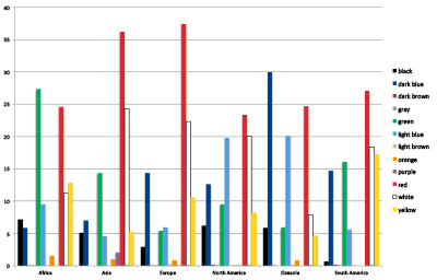
Figure 14: Percentage of usage of colors accros continents.
We performed an ANOVA to test if the continent had an influence on the per capita DGP and unemployment rate. Both measurements were significantly influenced by the continent (per capita DGP: F(5,162) = 10.745,p < 0.001); unemployment rate F(5,162) = 8.790,p < 0.001). A Bonferroni correct pairwise comparison revealed that Europe had significantly higher per capita GPA than all other continents and that Africa had a significantly higher unemployment rate than all other continents, except for Oceania. We can therefore conclude that the correlation between the colors and social economic indicators are based on the fact that African countries tend to be poorer and use more green than white.
3.3 Discussion
As described in Section 2 , we found that a fully automatic system was not possible for flags due to a number of confounding factors such as color gradients, special meaning of colors, and the human perceptual differences of colors given their surrounding context.
4 Case study: logos of financial institutions
To gain a first overview of the colors used in brand logos we acquired 7573 logos of international brands. We transformed the vector graphics to non-anti-aliased bitmap graphics and then ran our software without any human intervention on the sample. 62% of the logos had only two colors and 22% had three colors (see figure 15 ). The color of the background is also considered a color. This indicated that similar to flags, logos predominately make use of only a few colors.
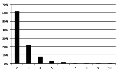
Figure 15: Percentage of usage of colors across all logos. 0.02% of the logos had more than ten colors.
For the design of a new logo it is of course not necessary to analyze all brand logos. It is sufficient to consider the logos of competitors. For this case study we arbitrarily selected financial institutions as the target market.
4.1 Method
4.1.1 Data Source
We selected 20 leading financial institutes based on their ranking in the Bankers Almanac7 , based on the year-end figures gained from submitted balance sheets. We acquired their vector format logos from Wikipedia, and processed them as described in Section 2 . From the processing stage we were able to obtain an eight-color model to represent the selected logos. The name and RGB definition of these colors is shown in Table 5 .
Table 5: The RGB values of the eight-color model for the banking logo dataset
| Color | R | G | B |
| black | 0 | 1 | 1 |
| dark blue | 39 | 49 | 109 |
| gray | 80 | 76 | 77 |
| green | 3 | 92 | 72 |
| light blue | 42 | 171 | 227 |
| red | 230 | 44 | 44 |
| white | 255 | 255 | 255 |
| yellow-green | 179 | 207 | 88 |
4.2 Results
We used the same method for calculating the distribution of colors as before. Figure 16 shows the result of our analysis and table 6 shows the occurrence for each of the eight colors. Black was the most popular color, followed by dark blue, red and green.
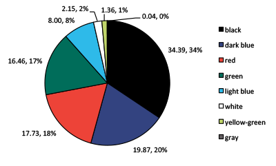
Figure 16: Distribution of normalized colors for all logos.
Table 6: The RGB values of the 8 colors and their proportional usage in all logos.
| color | % area | count |
| black | 34.39 | 11 |
| dark blue | 19.87 | 5 |
| gray | 0.04 | 1 |
| green | 16.46 | 6 |
| light blue | 8.00 | 3 |
| red | 17.73 | 10 |
| white | 2.15 | 5 |
| yellow-green | 1.36 | 1 |
Ten out of twenty logos analyzed used only two colors, excluding the background color of the paper. White was only registered if it was part of the logo itself. Five logos used only one color, four logos used three colors and one logo used five colors. The next step was to find the best new color combination for a bank logo. Similar to the flag case study we calculated a popularity matrix for all color combinations (see table 8 ). The combination of black with dark blue is the most popular combination. The combination of black with light blue is the most popular combination that is not already used, as can been seen by table 7 , that lists all the color combinations in actual use.
Table 7: Count, number of colors and probability for all the color combinations for all logos. The codes for the colors are: bl=black, dark blue=db, gray=ga, green=ge, light blue=lb, red=re, white=wh and yellow-green=yg.
| Color Combination | Count | Colors | Probability |
| db | 2 | 1 | 0.40 |
| lb | 1 | 1 | 0.20 |
| ge | 1 | 1 | 0.20 |
| bl | 1 | 1 | 0.20 |
| blre | 4 | 2 | 0.40 |
| dbre | 2 | 2 | 0.20 |
| rewh | 1 | 2 | 0.10 |
| geyg | 1 | 2 | 0.10 |
| blge | 1 | 2 | 0.10 |
| bldb | 1 | 2 | 0.10 |
| blrewh | 2 | 3 | 0.50 |
| gelbre | 1 | 3 | 0.25 |
| blgewh | 1 | 3 | 0.25 |
| blgagelbwh | 1 | 5 | 1.00 |
Table 8: Popularity of color combinations in all logos
| black | dark blue | gray | green | light blue | red | white | |
| dark blue | 54.26 | ||||||
| red | 52.12 | 37.60 | |||||
| green | 50.85 | 36.33 | 16.50 | ||||
| light blue | 42.39 | 27.87 | 8.04 | 24.46 | |||
| white | 36.54 | 22.02 | 2.20 | 18.61 | 10.15 | ||
| yellow-green | 35.75 | 21.23 | 1.40 | 17.82 | 9.36 | 19.09 | |
| gray | 34.43 | 19.91 | 0.09 | 16.50 | 8.04 | 17.77 | 2.20 |
Next we calculated a linear regression between the proportion of each color in each logo with the assets for each bank held in the USA. The only nearly significant correlation existed for the color red ( (r = -0.307,n = 20,p < 0.052). We plotted the amount of red in the logo against the size of assets in figure 17 and found the greater the assets, the lower the amount of red in the logo. We need to emphasize that this is only a correlation and it does not imply a causal relationship.
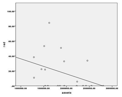
Figure 17: Correlation between the color red and the assets of the bank in the USA.
4.3 Discussion
The number of colors used in the logos and their tendency towards archetypical colors is similar to what we found in the analysis of the national flags. The logos typically have only a few colors and these colors are not muted or pale. It is also not surprising that black is the most popular color, since most typography uses black.
5 Conclusion
The Vexillology case study showed that our semi-automatic system is able to analyze the usage of colors for a given set of images. We calculated twelve colors that best approximate the colors used in all the national flags. These colors are unevenly distributed. Red, white, green and dark blue together make up for almost 75% of the surface in all flags. We also calculated the popularity for all the color combinations in all the flags. Based on this data, we would be able to suggest a unique and popular new flag. We then put the usage of the colors in the flags into a relationship with social-economic indicators. Despite the fact that there is absolutely no causal relationship between the colors used in a flag and the social economic indicators of a country, the color green in flags can be associated indirectly with poverty. The development of countries is in a constant state of fluctuation and the results of our social-economic analysis are likely to be different in the future. Still, we were able to demonstrate that it is in principle possible to associate the color information in images with external data. It is up to the design analyst to carefully apply this method and it is also necessary to emphasize that a correlation does not necessarily imply causality. Our system can be used to analyze a large set of images and provide insights into the usage of colors. This can inform a designer when making decisions on what colors to use for a new design.
The logo analysis of financial institutions showed that our system is also able to provide meaningful statistics for company logos. The results of the color analysis can be related to other indicators, such as the assets held by each bank in the USA. Our analysis showed that the only nearly significant correlation existed between the color red and the size of a companys assets. While the particular social-economic indicators used in this study might not be the most meaningful ones, our analysis shows the potential of combining external data with the results of the color analysis.
5.1 Limitations
Our system works best with graphics that have only a limited number of colors. Logos that use gradients are more difficult to normalize. It was therefore necessary to use non anti aliased images that can only efficiently be produced from an original vector format graphic. This limitation is still acceptable given that more than 60% of logos use only two colors. Our system would most certainly fail for the analysis of landscape photographs, but could probably work for pop art paintings.
We also need to mention again that we did not take any cultural or historical values into consideration. We did not consider the historical development of flags nor the values of colors in different cultures. The interested reader may consult the relevant literature on these topics, such as [2]. We only put the colors into a relationship with objective and easily quantifiable data, such as social-economic indicators or the size of a company.
Our system focused on analyzing logos only based on the color they contain. Our system should therefore be complemented by other design considerations. Our system can be used as a supporting analysis tool in the design process for the design of new brand logos. It is not intended to be a replacement for an actual designer, but as a tool that informs designers about the design space. The true creative idea development still has to come from the designer.
References
- Voxi Heinrich Amavilah. National flags, national flag colors, and the well-being of countries. MPRA Paper 11304, University Library of Munich, Germany, October 2008.
- Mubeen M. Aslam. Are you selling the right colour? a cross?cultural review of colour as a marketing cue. Journal of Marketing Communications, 12(1):15–30, 2006.
- Paul A. Bottomley and John R. Doyle. The interactive effects of colors and products on perceptions of brand logo appropriateness. Marketing Theory, 6(1):63–83, 2006.
- Leif E. Hem and Nina M. Iversen. How to develop a destination brand logo: A qualitative and quantitative approach. Scandinavian Journal of Hospitality and Tourism, 4(2):83–106, 2004.
- Niki Hynes. Colour and meaning in corporate logos: An empirical study. Journal of Brand Management, 16(8):545–555, 2008.
- Martin S. Lindauer. Color preferences among the flags of the world. Perceptual and Motor Skills, 29(3):892–894, 1969.
- Thomas J. Madden, Kelly Hewett, and Martin S. Roth. Managing images in different cultures: A cross-national study of color meanings and preferences. Journal of International Marketing, 8(4):pp. 90–107, 2000.
- Jon McLoone. Flag analysis with mathematica. http://blog.wolfram.com/2009/02/12/flag-analysis-with-mathematica/, 2009. Accessed: 21/11/2012.
- Zena O’Connor. Environmental colour mapping using digital technology: a case study. Urban Des Int, 11(1):21–28, 2006.
- Zena O’Connor. Logo colour and differentiation: A new application of environmental colour mapping. Color Research Application, 36(1):55–60, 2011.
- Wally Olins. Corporate Identity: Making Business Strategy Visible Through Design. Harvard Business School Press, 1992.
- Tom Porter. Environmental colour mapping. Urban Design International, 2(1):23–31, 1997.
- Wang Qingbin. Statistical analysis on the enterprise logo color designs of global 500. In IEEE 10th International Conference on Computer-Aided Industrial Design Conceptual Design, pages 277–280, 2009.
- Alfred Znamierowski. The world encyclopedia of flags: the definitive guide to international flags, banners, standards and ensigns. Anness, 2010.
This is a pre-print version of the paper | January 27, 2014 All Publications